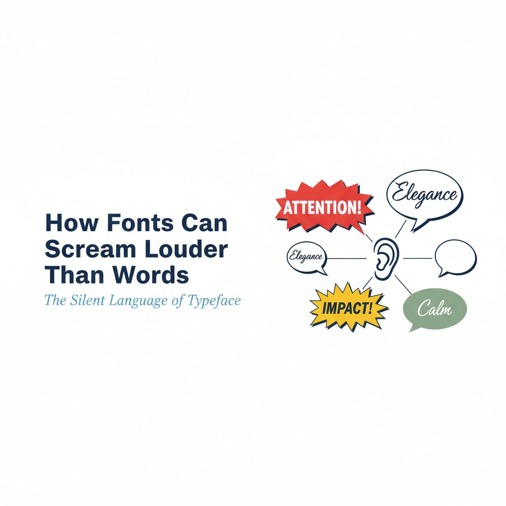
Fonts Are Silent Shouters
Fonts are not neutral. Although words carry meaning, fonts carry emotion. Because typography shapes tone before text is read, fonts scream louder than words. Fonts don’t just decorate they dramatize.
When brands master typography, they transform ordinary messages into unforgettable performances. As a result, audiences feel emotion before they process meaning.
Why Fonts Matter More Than Words
Fonts are psychological triggers. They influence perception instantly.
Fonts Shape First Impressions
First impressions decide engagement. Because fonts set tone immediately, they determine whether audiences trust, laugh, or recoil. This influence makes typography critical.
Fonts Carry Personality
Words may be identical. Although fonts change, meaning shifts. Consequently, typography transforms tone from playful to serious, from dramatic to dull.
Fonts Amplify Emotion
Emotion drives memory. Because fonts exaggerate mood, they intensify impact. This amplification makes messages unforgettable.
The Psychology of Font Styles
Different fonts scream different emotions.
Serif Fonts: Authority and Tradition
Serifs feel classic. Because they signal heritage, they build trust. This makes them perfect for institutions.
Sans‑Serif Fonts: Modern and Clean
Sans‑serifs feel fresh. Although they lack ornament, they signal clarity. Consequently, they dominate digital branding.
Script Fonts: Elegance and Personality
Scripts feel human. Because they mimic handwriting, they add intimacy. This intimacy builds emotional connection.
Bold Fonts: Power and Drama
Bold fonts shout. Although they may overwhelm, they demand attention. This demand fuels virality.
Minimal Fonts: Calm and Neutral
Minimal fonts whisper. Because they avoid drama, they feel safe. This safety reduces risk but also reduces impact.
How Fonts Influence Branding
Typography defines identity.
Fonts Create Recognition
Recognition builds loyalty. Because fonts become visual signatures, audiences remember them. This memory strengthens brand equity.
Fonts Differentiate Competitors
Differentiation drives choice. Although products may be similar, fonts create unique personality. Consequently, typography becomes competitive advantage.
Fonts Reinforce Messaging
Messaging requires consistency. Because fonts align tone with words, they reinforce meaning. This reinforcement increases clarity.
Examples of Fonts Screaming Louder Than Words
Typography dominates iconic brands.
Coca‑Cola’s Script Font
Coca‑Cola’s script feels personal. Because it mimics handwriting, it builds intimacy. This intimacy fuels nostalgia.
Nike’s Bold Sans‑Serif
Nike’s typography feels powerful. Because it is bold, it amplifies “Just Do It.” This amplification makes the slogan iconic.
The New York Times’ Serif
The Times uses serif authority. Because it signals tradition, it builds credibility. This credibility reinforces journalism.
Spotify’s Rounded Sans‑Serif
Spotify’s typography feels playful. Because it is rounded, it signals creativity. This creativity aligns with discovery.
Why Fonts Can Outperform Words
Typography often dominates text.
Fonts Trigger Emotion Faster
Emotion precedes logic. Because fonts shape mood instantly, they outperform words. This speed increases impact.
Fonts Create Visual Memory
Memory favors visuals. Although words fade, fonts stick. Consequently, typography builds recognition.
Fonts Influence Behavior Subconsciously
Behavior often bypasses awareness. Because fonts shape perception subconsciously, they drive decisions invisibly. This influence makes them powerful.
How to Use Fonts Strategically
Fonts must be intentional.
Match Font to Brand Personality
Fonts must align with identity. Because mismatched typography confuses audiences, brands must choose carefully.
Use Fonts to Amplify Emotion
Fonts exaggerate mood. When brands align typography with emotion, they intensify impact. This intensity fuels engagement.
Balance Fonts Across Platforms
Fonts look different on screens. Because digital environments vary, testing ensures consistency. This consistency builds trust.
Pair Fonts for Contrast
Contrast creates drama. When fonts pair strategically, they amplify tension. This amplification increases memorability.
The Risks of Fonts Screaming Too Loud
Typography must be controlled.
Fonts Can Overwhelm Content
Excessive drama distracts. Because fonts dominate, they may overshadow meaning. This distraction reduces clarity.
Fonts Can Miscommunicate Identity
Typography carries cultural meaning. When brands misuse fonts, they send wrong signals. Consequently, identity suffers.
Fonts Can Reduce Accessibility
Complex fonts hinder readability. Since accessibility matters, brands must balance style with clarity.
The Odd Boss Philosophy: Fonts Are Theatre
Odd bosses don’t treat fonts as decoration. They treat them as performance. Although words carry meaning, fonts carry emotion. Because people follow energy, typography becomes branding’s loudest scream.
Fonts are not passive. They are active performers. They dramatize identity. They exaggerate emotion. They amplify meaning. When brands embrace typography, they stop whispering and start commanding attention.
Conclusion: Fonts Scream Louder Than Words Because They Shape Emotion First
Fonts dominate perception. They capture attention. They amplify emotion. They build memory. Because audiences react to typography before text, fonts scream louder than words.
When brands master fonts strategically, they unlock new levels of recognition. That shift transforms their presence, their reach, and their influence.
Ready to Make Fonts Scream for Your Brand?
If you want typography that feels bold, dramatic, and impossible to ignore, you’re ready for the Odd Boss approach.
👉 Partner with My Odd Boss to craft font strategies that shout identity, amplify emotion, and dominate the feed.
Let’s turn your typography into theatre.