Bold Colors Are Branding’s Loudest Voice
Colors speak louder than words. Although logos, fonts, and taglines matter, bold colors dominate perception instantly. Because the human brain processes color faster than text, bold hues become emotional shortcuts. Bold colors don’t whisper professionalism they scream identity.
When brands embrace bold colors strategically, they don’t just decorate. They dramatize. As a result, they command attention, shape memory, and influence behavior.
Why Bold Colors Matter in Branding
Bold colors are not decoration. They are psychology in action.
They Capture Attention Instantly
Attention is scarce. Because bold colors stand out in crowded feeds, they hook the eye immediately. This instant capture increases visibility.
They Create Emotional Impact
Emotion drives decisions. Although subtle colors feel calm, bold colors provoke stronger reactions. Consequently, they amplify brand personality.
They Strengthen Recall
Memory favors intensity. Because bold colors leave stronger imprints, audiences remember them longer. This recall builds recognition.
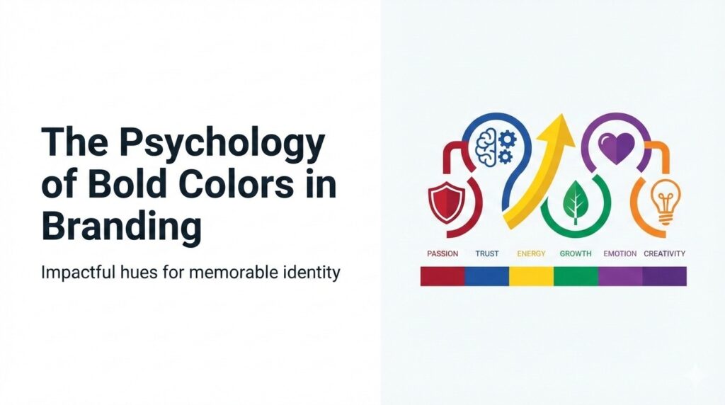
The Psychology of Specific Bold Colors
Different bold colors trigger different emotions.
Red: The Color of Urgency and Passion
Red accelerates the heartbeat. Because it signals urgency, it drives action. This is why sales banners often use red.
Yellow: The Color of Optimism and Energy
Yellow radiates positivity. Although it can feel overwhelming, it sparks joy. Consequently, brands use yellow to appear approachable.
Blue: The Color of Trust and Authority
Blue calms the mind. Because it signals stability, it builds trust. This is why banks and tech giants often use bold blues.
Green: The Color of Growth and Balance
Green connects to nature. Although subtle greens feel soothing, bold greens signal vitality. As a result, eco‑brands use green to emphasize sustainability.
Orange: The Color of Creativity and Playfulness
Orange energizes. Because it blends red’s urgency with yellow’s optimism, it feels adventurous. This makes it perfect for lifestyle brands.
Purple: The Color of Luxury and Imagination
Purple feels regal. Although lighter shades feel whimsical, bold purples signal prestige. Consequently, luxury brands embrace it.
Black: The Color of Power and Drama
Black dominates. Because it feels bold and timeless, it conveys authority. This makes it a favorite for fashion and luxury.
The Emotional Science Behind Bold Colors
Bold colors work because they manipulate emotional responses.
They Trigger Faster Brain Processing
The brain processes color before text. Because bold colors are more intense, they accelerate recognition. This speed increases impact.
They Influence Mood Subconsciously
Colors shape mood without awareness. Although people may not notice consciously, bold hues alter emotional states. Consequently, they affect decisions.
They Create Associations Instantly
Colors carry cultural meaning. Because bold colors exaggerate these meanings, they strengthen associations. This amplification builds brand identity.
Examples of Bold Colors in Branding
Bold colors dominate iconic brands.
Coca‑Cola’s Bold Red
Coca‑Cola uses red to signal energy and excitement. Because red feels urgent, it drives consumption.
McDonald’s Bold Yellow and Red
McDonald’s combines red urgency with yellow optimism. This combination creates appetite and joy.
Spotify’s Bold Green
Spotify uses green to signal vitality and creativity. Because green feels fresh, it aligns with discovery.
Nike’s Bold Black
Nike uses black to signal power. This boldness amplifies its “Just Do It” identity.
Why Subtle Colors Fail in Branding
Subtlety doesn’t dominate.
They Blend Into Backgrounds
Subtle colors feel safe. Because they don’t stand out, they fade quickly. This invisibility kills impact.
They Lack Emotional Punch
Emotion drives virality. Although subtle colors feel calm, they don’t provoke. Consequently, they fail to inspire.
They Weaken Recall
Memory favors intensity. Since subtle colors lack drama, they fade from memory. This weakens recognition.
How to Use Bold Colors Strategically
Bold colors must be intentional.
Match Color to Brand Personality
Colors must align with identity. Because mismatched colors confuse audiences, brands must choose carefully.
Use Bold Colors for Key Elements
Boldness works best in logos, CTAs, and headlines. Although entire palettes can be bold, focal points maximize impact.
Balance Bold With Neutral
Balance prevents overwhelm. When bold colors pair with neutrals, they feel powerful without chaos.
Test Bold Colors Across Platforms
Colors look different on screens. Because digital environments vary, testing ensures consistency.
The Risks of Bold Colors
Boldness isn’t always safe.
They Can Overwhelm Audiences
Too much boldness feels aggressive. Because audiences crave balance, excess reduces trust.
They Can Miscommunicate Identity
Colors carry cultural meaning. When brands misuse bold hues, they send wrong signals. Consequently, identity suffers.
They Can Limit Flexibility
Bold palettes dominate. Although they create recognition, they reduce adaptability. This rigidity can restrict campaigns.
The Odd Boss Philosophy: Bold Colors Are Theatre
Odd bosses don’t decorate. They dramatize. Although subtlety feels safe, bold colors feel alive. Because people follow energy, bold colors become branding’s loudest voice.
Bold colors aren’t just visuals. They are performances. They are emotional scripts. They are psychological triggers. When brands embrace boldness, they stop blending in and start commanding attention.
Conclusion: Bold Colors Win Because They Command Emotion
Bold colors interrupt the scroll. They provoke emotion. They build memory. Because audiences crave intensity, bold colors dominate branding.
When brands embrace bold colors strategically, they unlock new levels of recognition. That shift transforms their presence, their reach, and their influence.
Ready to Use Bold Colors Like an Odd Boss?
If you want branding that feels bold, dramatic, and impossible to ignore, you’re ready for the Odd Boss approach.
👉 Partner with My Odd Boss to craft color strategies that shock, seduce, and dominate. Let’s turn your palette into a performance.