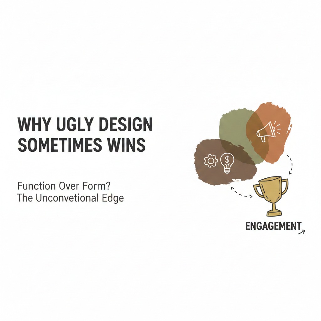
Why Ugly Design Sometimes Wins
When Ugly Becomes Irresistible
Ugly design breaks every rule. Although sleek visuals dominate branding textbooks, ugly design sneaks into feeds and steals attention. Because audiences crave authenticity, imperfection often feels more human. Ugly design doesn’t whisper elegance it screams relatability.
When brands embrace ugly design strategically, they don’t just stand out. They dominate. As a result, their content spreads faster, feels more approachable, and often converts better than polished campaigns.
Why Ugly Design Wins Attention
Attention is the currency of the internet. Ugly design earns it by breaking expectations.
It Interrupts the Scroll
Feeds are filled with polished perfection. Because ugly design looks different, it shocks the eye. This interruption forces people to pause. Consequently, ugly design grabs attention instantly.
It Feels More Authentic
Audiences distrust perfection. Although polished design looks professional, it often feels artificial. Ugly design feels raw, human, and honest. As a result, people connect emotionally.
It Signals Relatability
Relatability drives engagement. Because ugly design mirrors everyday imperfection, audiences see themselves in it. This recognition increases loyalty.
The Psychology Behind Ugly Design
Ugly design works because it taps into deep psychological instincts.
People Value Novelty Over Perfection
Novelty excites the brain. Because ugly design breaks norms, it feels fresh. This freshness sparks curiosity and engagement.
People Trust Imperfection
Imperfection signals honesty. Although sleek design feels rehearsed, ugly design feels spontaneous. Consequently, audiences trust it more.
People Remember What Feels Different
Memory favors contrast. When everything looks polished, ugly design stands out. As a result, it becomes more memorable.
Examples of Ugly Design Winning Online
Ugly design isn’t theory it’s practice.
Meme Culture Thrives on Ugly Design
Memes rarely look polished. Because they embrace chaos, they spread faster. Ugly fonts, clashing colors, and distorted images fuel virality.
Street Posters That Look Chaotic
Street posters often ignore design rules. Although they look messy, they capture attention. This chaos makes them effective.
Startups Using DIY Graphics
Startups often lack design budgets. Because they use DIY visuals, their content feels authentic. This authenticity builds trust.
Influencers Using Raw Screenshots
Screenshots look ugly. However, they feel real. Consequently, audiences engage more with them than polished graphics.
Why Polished Design Sometimes Fails
Polished design isn’t always the answer.
It Blends Into the Feed
Polished design looks good. Because everything looks good, it becomes invisible. This invisibility kills engagement.
It Feels Too Corporate
Corporate polish feels distant. Although it signals professionalism, it lacks personality. Consequently, audiences disengage.
It Overcomplicates Communication
Polished design often prioritizes aesthetics over clarity. Since clarity drives action, polished design sometimes fails to convert.
How to Use Ugly Design Strategically
Ugly design must be intentional, not careless.
Choose Ugly Elements That Amplify Emotion
Ugly fonts, clashing colors, or distorted images can amplify humor, chaos, or urgency. Because emotion drives virality, these elements increase impact.
Balance Ugly With Clarity
Ugly design must still communicate clearly. Although visuals may look chaotic, the message must remain obvious. This balance ensures effectiveness.
Use Ugly Design for Relatable Content
Ugly design works best for memes, confessions, or raw storytelling. Because these formats thrive on imperfection, ugly design amplifies them.
Test Ugly vs. Polished
Testing reveals what works. When brands compare ugly and polished versions, they often find ugly wins in engagement. Consequently, they learn where to use it.
The Emotional Power of Ugly Design
Ugly design creates emotional reactions that polished design cannot.
It Makes People Laugh
Ugly visuals often feel absurd. Because absurdity triggers humor, audiences share them widely.
It Makes People Feel Seen
Ugly design mirrors everyday imperfection. Since audiences relate, they feel represented. This representation builds loyalty.
It Makes People Curious
Curiosity drives clicks. When design looks unusual, people investigate. Consequently, ugly design increases exploration.
Ugly Design in Marketing Campaigns
Brands have used ugly design successfully.
Political Campaigns Using Raw Posters
Raw posters often outperform polished ads. Because they feel grassroots, they attract attention.
Retail Brands Using Loud Flyers
Loud, ugly flyers dominate streets. Although they break design rules, they drive foot traffic.
Digital Brands Using Meme‑Style Ads
Meme‑style ads look ugly. However, they spread faster than polished campaigns. This virality increases reach.
Why Ugly Design Creates Virality
Virality requires energy. Ugly design delivers it.
It Sparks Conversation
Ugly design makes people talk. Because it looks unusual, audiences debate it. This debate fuels engagement.
It Encourages Sharing
People share what feels funny, raw, or shocking. Since ugly design triggers these emotions, it spreads quickly.
It Builds Community
Ugly design feels accessible. Because anyone can create it, audiences join in. This participation builds community.
The Risks of Ugly Design
Ugly design isn’t always safe.
It Can Damage Brand Perception
Ugly design may look unprofessional. Because perception matters, brands must use it carefully.
It Can Confuse Audiences
Ugly design sometimes hides clarity. Since clarity drives action, confusion reduces effectiveness.
It Can Backfire If Overused
Overuse dulls impact. Although ugly design wins occasionally, constant use may weaken trust.
How to Balance Ugly and Polished Design
Balance creates strength.
Use Ugly for Virality, Polished for Authority
Ugly design drives attention. Polished design builds credibility. Because both matter, brands must balance them.
Match Design Style to Platform
Ugly design thrives on TikTok, Twitter, and meme culture. Polished design thrives on LinkedIn and corporate websites. Consequently, brands must adapt.
Match Design Style to Audience
Young audiences embrace ugly design. Professional audiences prefer polish. Since audience matters, brands must choose wisely.
The Odd Boss Philosophy: Ugly Is a Weapon
Odd bosses don’t fear ugly design. They wield it. Although polish feels safe, ugly design feels alive. Because people follow energy, ugly design becomes a weapon.
Ugly design isn’t failure. It’s strategy. It’s rebellion. It’s theatre. When brands embrace it intentionally, they stop blending in and start dominating.
Conclusion: Ugly Design Wins Because It Breaks Rules
Ugly design interrupts the scroll. It sparks emotion. It creates virality. Because audiences crave authenticity, ugly design sometimes wins where polish fails.
When brands embrace ugly design strategically, they unlock new levels of engagement. That shift transforms their presence, their reach, and their influence.
Ready to Use Ugly Design Like an Odd Boss?
If you want design that feels bold, dramatic, and impossible to ignore, you’re ready for the Odd Boss approach.
👉 Partner with My Odd Boss to craft campaigns that use ugly design strategically to shock, to entertain, and to dominate.
Let’s turn imperfection into your competitive advantage.